Every company entering the market for the first time needs to be recognized as soon as possible.
For this reason, the logo is one of the first elements to be taken into consideration. Following a few rules can help you create a high-impact logo.
Below you will find four tips for creating a professional logo with Desinghill logo maker and increase your brand reputation.
1. Find the right inspiration and avoid the most common mistakes
To create the ideal logo, it is essential to find the right inspiration. To do this, tricks are available that prove to be very effective in kicking off the entire creative process. It will be necessary to understand how competitors have previously moved in this area, thinking about how to improve the choices adopted by the latter.
If not precisely better, the choices must be different to stand out. Then focus on the message you want to convey, considering the target audience. Try to visualize a possible advantage that the consumer will have by using the company’s services or goods.
It will also be necessary to think about your company’s name to more easily assess whether it is convenient to focus on an image or writing. When the inspiration has paid off, leading to the birth of an idea, the time has come to translate the latter on paper; it is essential to do it immediately before what has been born from one’s mind vanishes completely.
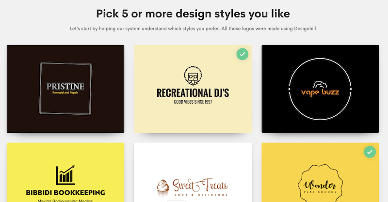
With Designhill logo maker, you can automate this process by choosing the graphic you prefer in the first step of the logo creation with their AI tool:
2. Match the right colors to a logo
An essential element is represented by color. Many studies have established how color has a direct influence on a person’s purchasing decision. In this regard, we speak of the “psychology of color.”
It is enough to look at the company brands to realize the importance of this topic. For example, you will notice how red is one of the most used colors in the logos of companies operating in the food sector (it is considered a color that can whet the appetite).
On the other hand, blue is often used in institutional logos; yellow appears in the logos of various oil companies (it is a color that immediately brings to mind energy), and gray is one of the favorite colors of car manufacturers.
Still, on the subject of colors, a suggestion is not to use more than three within the same logo; this will avoid confusion in those who observe it and, at the same time, will allow for better performance if the logo must appear in print made in black and white.
With Desinghill logo maker, you need to choose your favorite colors and the AI tool with creating the graphics for you:
![]()
3. Choose the perfect font to make it stand out
In addition to the color, the choice of the font is essential.
In many cases, the success of a company name was also possible thanks to a perfect typeface (the most famous case is that of Coca-Cola).
If some logos are textual only, others combine symbols with the characters; therefore, it is essential to understand the character’s relevance based on the company’s business. When creating an abstract logo, that is, a logo that “hides” a symbol inside it, a specific font should be used (for example, the Serif or the San Serif); stylists, on the other hand, usually use the “Hand Signed “logos.
Other companies, on the other hand, aim to stand out thanks to a fresh look. There are also 3D logos, whose three-dimensionality is made effective by square characters.
In the last step of the logo creation with Designhill, you can choose and edit the font, colors, symbols, containers, graphics, and many other options:
![]()
4. Value simplicity to achieve a successful logo
When designing a logo, it is good to avoid abusing the many “special effects” that graphics programs make available; there are several:
- Gradients
- Reflexes
- Shadows
- Floreal patterns
If one or two effects can be a way to make the logo unique, using too many of them would only confuse the logo itself, diverting the interest of potential customers. Furthermore, a logo should be designed within a defined shape (for example, a square).
Finally, let go of even unnecessarily complicated and complex details. If choosing the right colors or font could boost the logo, adding graphic elements to differentiate it can prove to be a double-edged sword.
While certainly appearing original, the risk will be that of being excessively artificial and too “complicated.” In many cases, subtracting elements from a graphic project can represent the best way; a clear, simple, and clean symbol will have a better chance of being remembered.
EDITOR'S PICKS
 5 Tips To Getting Authentic Online Reviews
 Best Spread Sheets Functions For Small Business Owners
 Thank You, Come Again: Tips For Success In Retail
 Why Having an FAQ Section Is Beneficial
 8 Tips To Make Moving Home Easier
 7 Simple Marketing Tips For Small Software Companies
 Opening Your Small Business: 10 Things You Shouldn’t Forget
 Start Investing in Day Trading
 12 Essentials That Every Productive Office Needs
 How To Reduce Your Overheads Without Ruining Your Company
 You Must Read These Marketing Tips If You Want To Be Successful!
 4 Awesome Ways Your Business Can Make More Money!